VIS 2020 [paper] - Belief updating from scatterplots
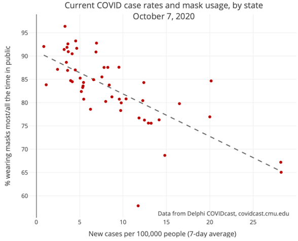
24 Oct 2020Do people change their beliefs when they see a data visualization like a scatterplot? Communicating science and making evidence-based arguments often involve data visualizations like the one below. It can be tempting to think that “the data speaks for itself”—that it paints a clear, relatively unambiguous picture about the relationship between a set of variables. But the mere presentation of statistical evidence, no matter how strong, does not guarantee that people will change their minds, particularly when they have strong preexisting beliefs that run counter to the data.1
In a new VIS 2020 paper, my colleagues and I examined how people update their beliefs about statistical relationships when viewing scatterplots. We developed some new methods for eliciting beliefs about these relationships and used computational modeling to evaluate the impact of different types of scatterplot visualizations on belief updating. This project adds to a growing number of studies that aim to better understand (and model) how people learn through interactive data visualizations, including cases where such visualizations fail to persuade.
-
A favorite paper of mine which reviews the many ways people avoid updating their beliefs in the face of contradictory evidence is Chinn and Brewer (1993). ↩